Tutorial - How to use candlestick pattern in forex trading. (Part 1)
Posted by
nimzoindy
Labels:
Forex
You may be asking yourself, "If I can already use bar charts to view prices, then why do I need another type of chart?" The answer to this question may not seem obvious, but after going through the following candlestick chart explanations and examples, you will surely see value in the different perspective candlesticks bring to the table. In my opinion, they are much more visually appealing, and convey the price information in a quicker and easier manner. The Japanese began using technical analysis to trade rice in the 17th century. While this early version of technical analysis may have been different from the US version initiated by Charles Dow around 1900, many of the guiding principles were very similar. The "what" (price action) is more important than the "why" (news, earnings, and so on). All known information is reflected in the price. Buyers and sellers move markets based on expectations and emotions (fear and greed).
Markets fluctuate.
The actual price may not reflect the underlying value.
According to Steve Nison, candlestick charting came later and probably began sometime after 1850. Much of the credit for candlestick development and charting goes to Homma, a legendary rice trader from Sakata. Even though it is not exactly clear "who" created candlesticks, Nison notes that they likely resulted from a collective effort developed over many years of trading.
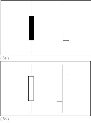
 The body of the candlestick is called the real body, and represents the range between the open and closing prices. A black or filled-in body represents that the close during that time period was lower than the open, (normally considered bearish) and when the body is open or white, that means the close was higher than the open (normally bullish). The thin vertical line above and/or below the real body is called the upper/lower shadow, representing the high/low price extremes for the period.
Bar Compared to Candlestick Charts
Below is an example of the same price data conveyed in a standard bar chart and a candlestick chart. Notice how the candlestick chart appears 3-dimensional, as price data almost jumps out at you.
 The long, dark, filled-in real body represents a weak (bearish) close ( 3a ), while a long open, light-colored real body represents a strong (bullish) close ( 3b ). It is important to note that Japanese candlestick analysts traditionally view the opening and closing prices as the most moment critical of the day. At a glance, notice how much easier it is with candlesticks to determine if the closing price was higher or lower than the opening price.
Subscribe to:
Post Comments (Atom)


Post a Comment